Milwaukee is famous for its tavern culture, boasting one of the highest concentrations of bars per capita in the country. After the disruption of the pandemic, Lions' Hospitality Group needed to aggressively reestablish their presence—not only to bring their loyal regulars back, but to expand their reach and attract a new wave of customers. In a sea of establishments claiming to offer a traditional pub experience, they needed to firmly plant their flag and be recognized by footie fans, expats, and locals alike as the authentic British pubs in Milwaukee County.
I came on board as their in-house creative to visually connect their distinct entities—Three Lions Pub, Red Lion Pub, and Lions' Catering. The goal was to establish a cohesive identity that proved to patrons they were getting the exact same uncompromising authenticity at either location, ultimately helping to capture that new market share and cement their status as a community staple.
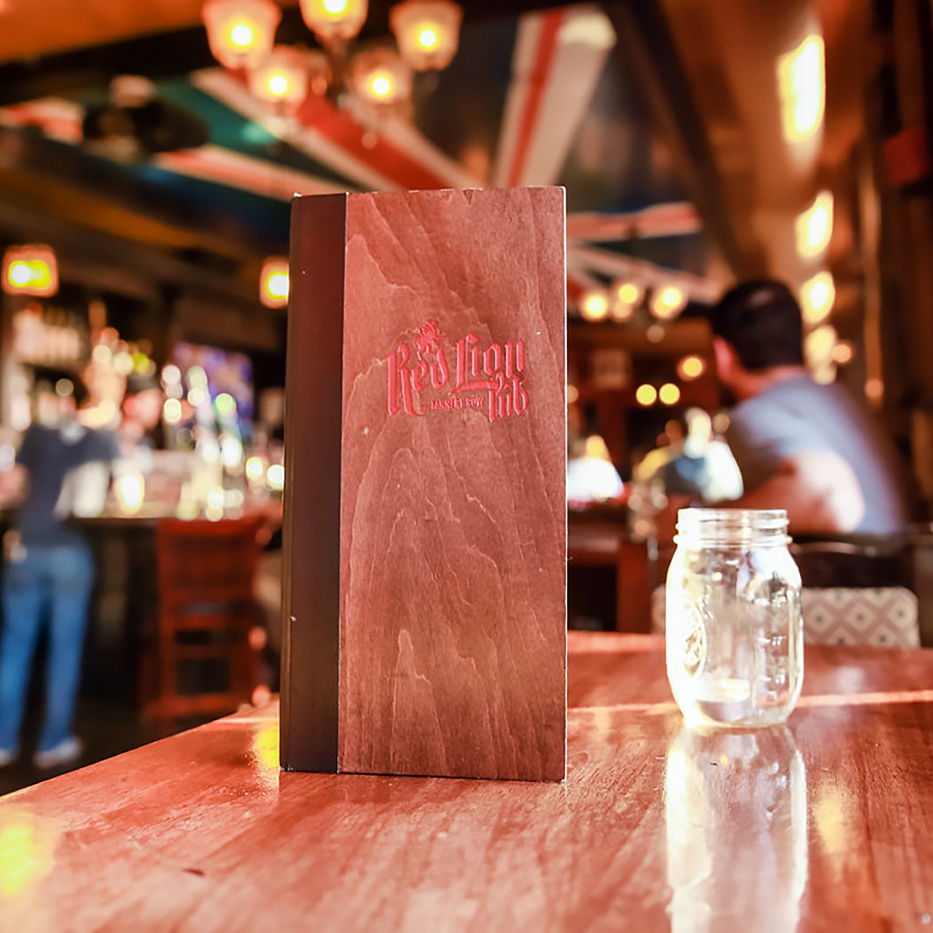
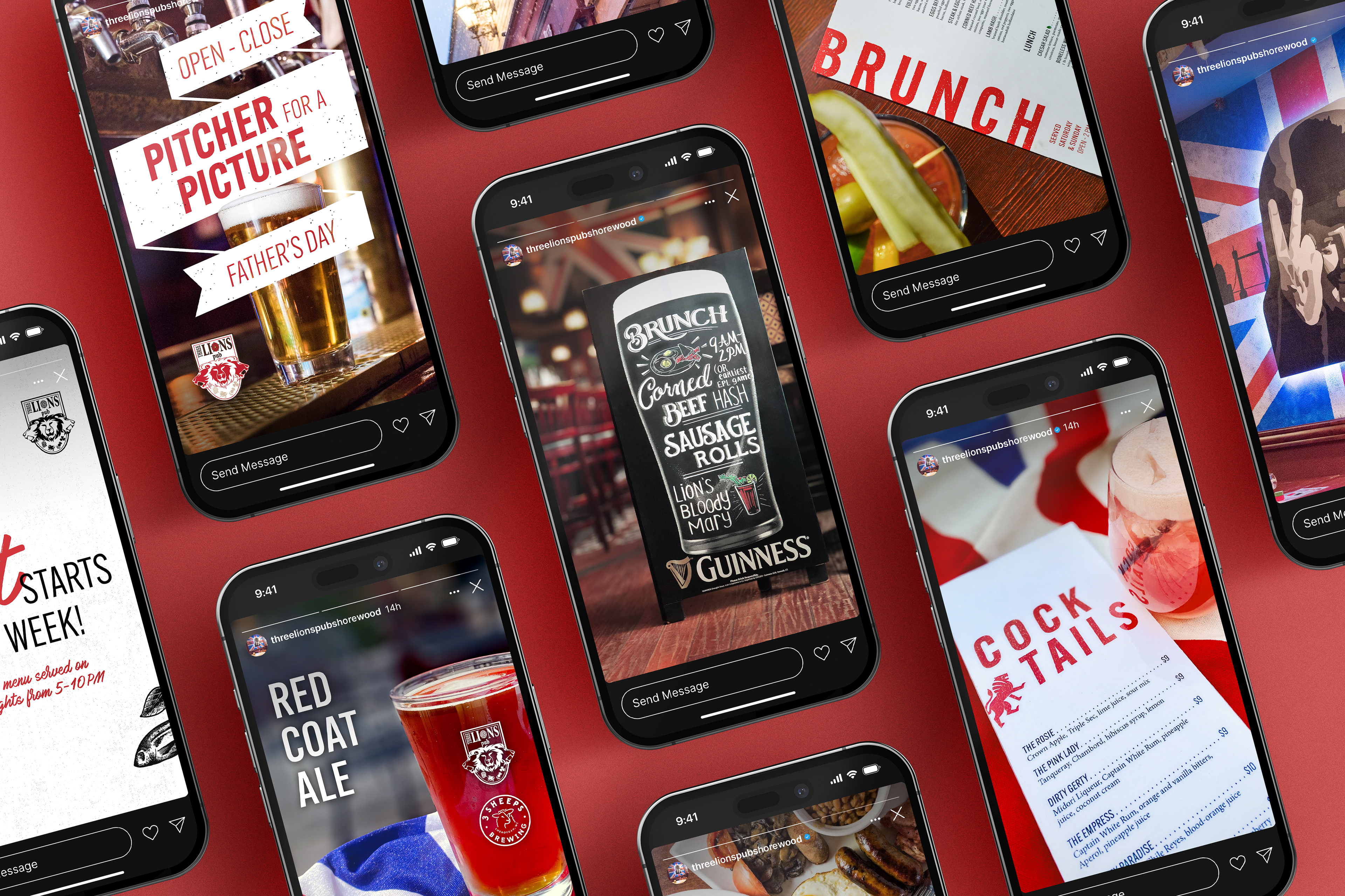
To capture that authentic energy and reinvigorate the community, I developed a visual language directly inspired by the eclectic, traditional decor already adorning the walls of both pubs. This grounded the new brand elements in the physical spaces the patrons already loved, translating the feeling of a true British living room into all of their marketing.
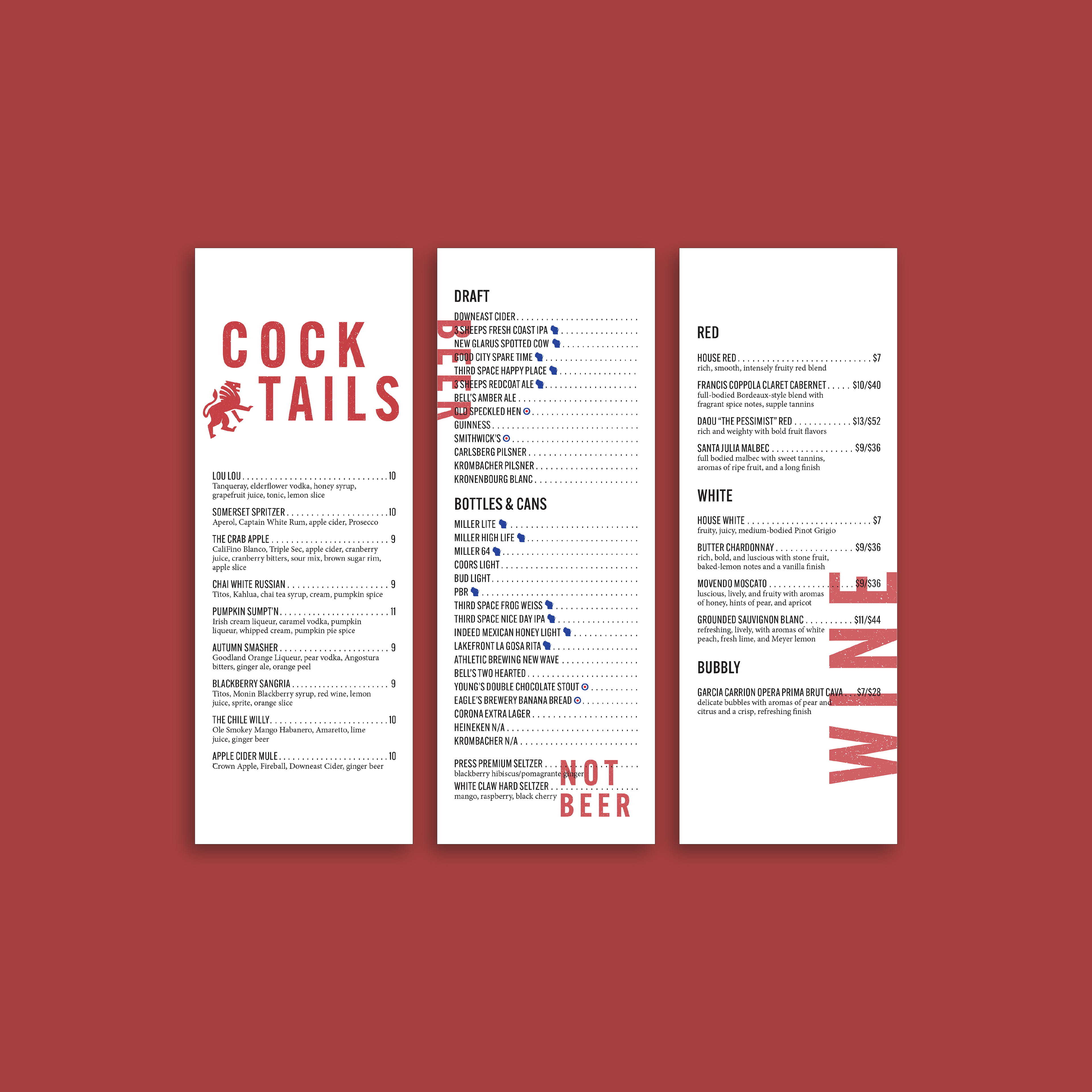
This unified strategy was applied across a robust, shared menu system and physical event collateral. Aligning the core aesthetic across both pubs not only created a reliable, welcoming experience the moment a patron sat down, but it also provided a smart business solution—drastically reducing the budget that was previously spent on constantly designing and printing two entirely separate sets of menus.
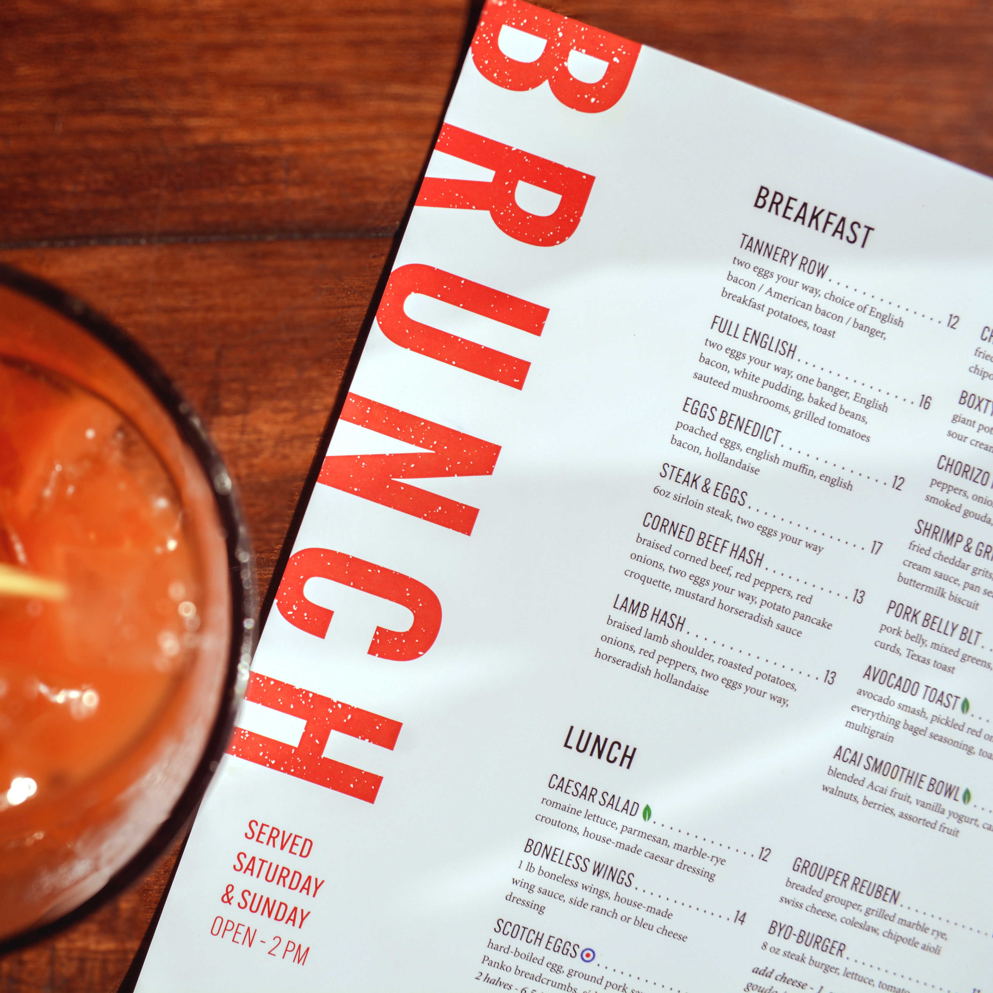
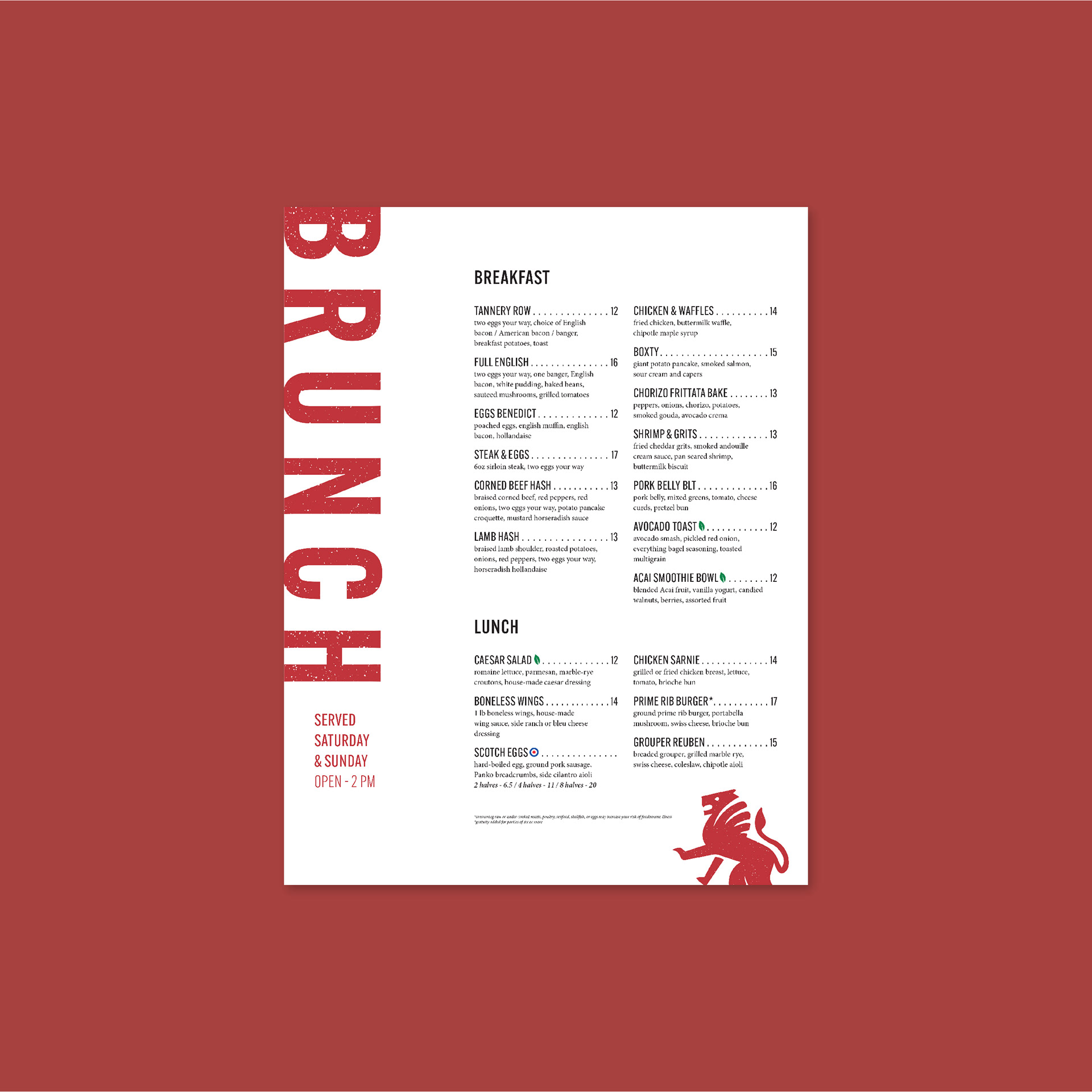
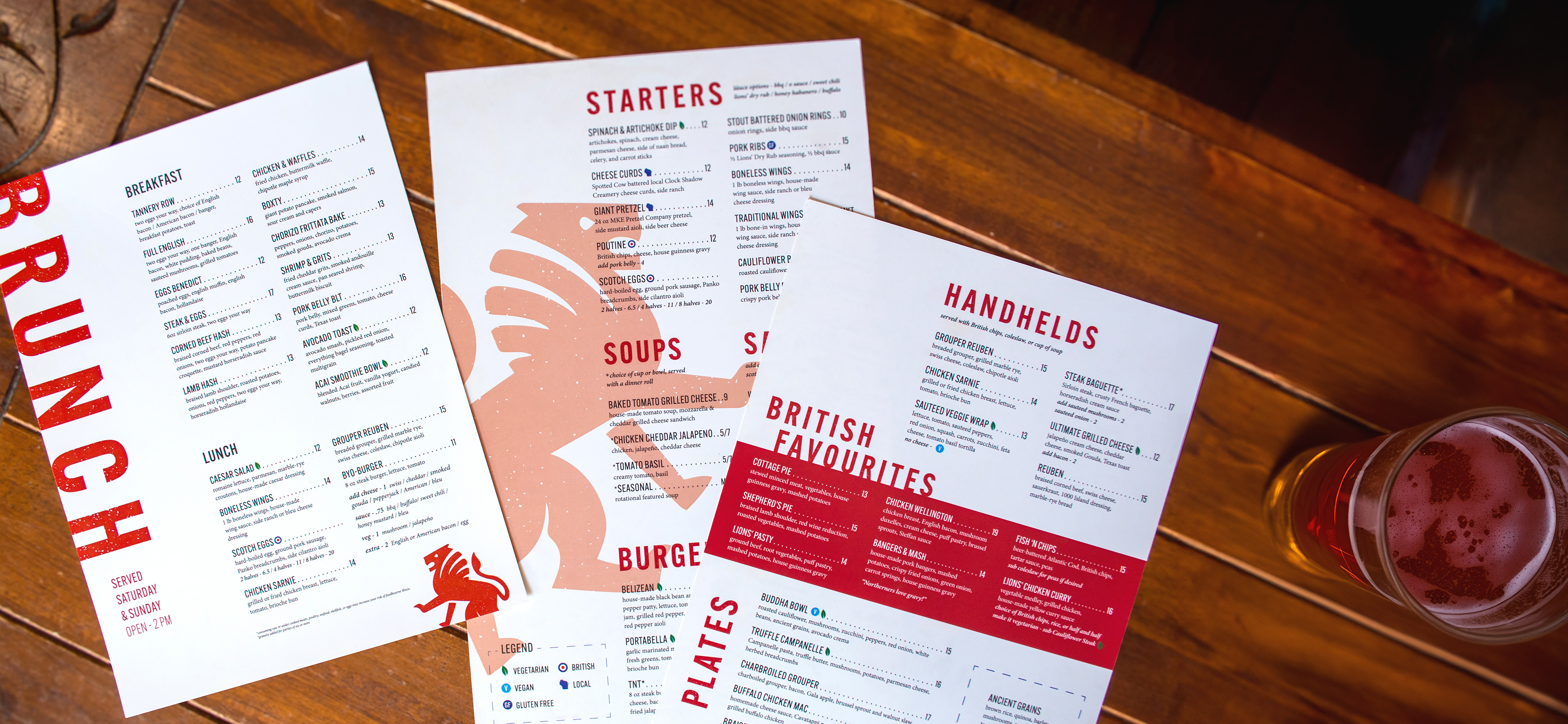
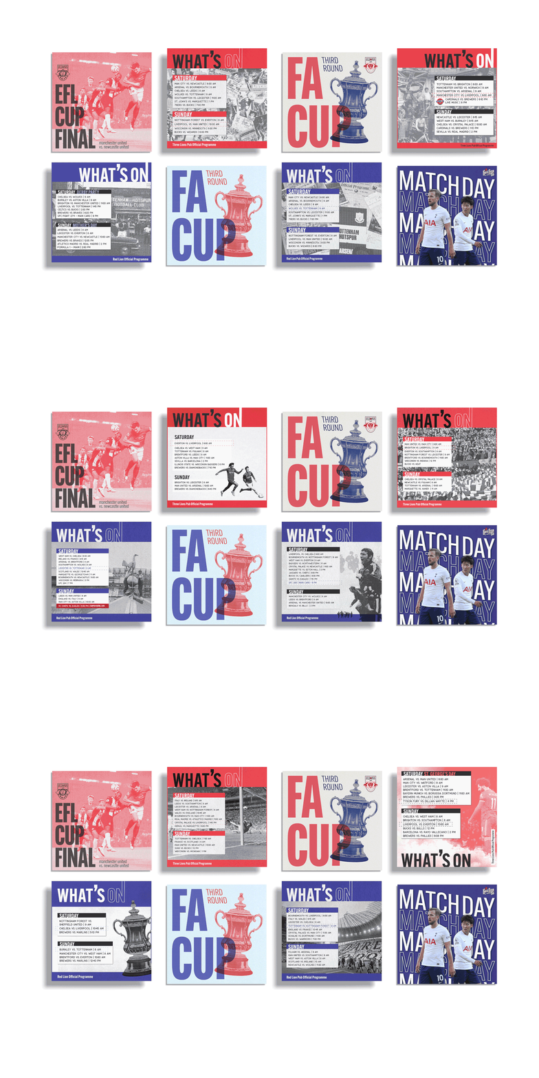
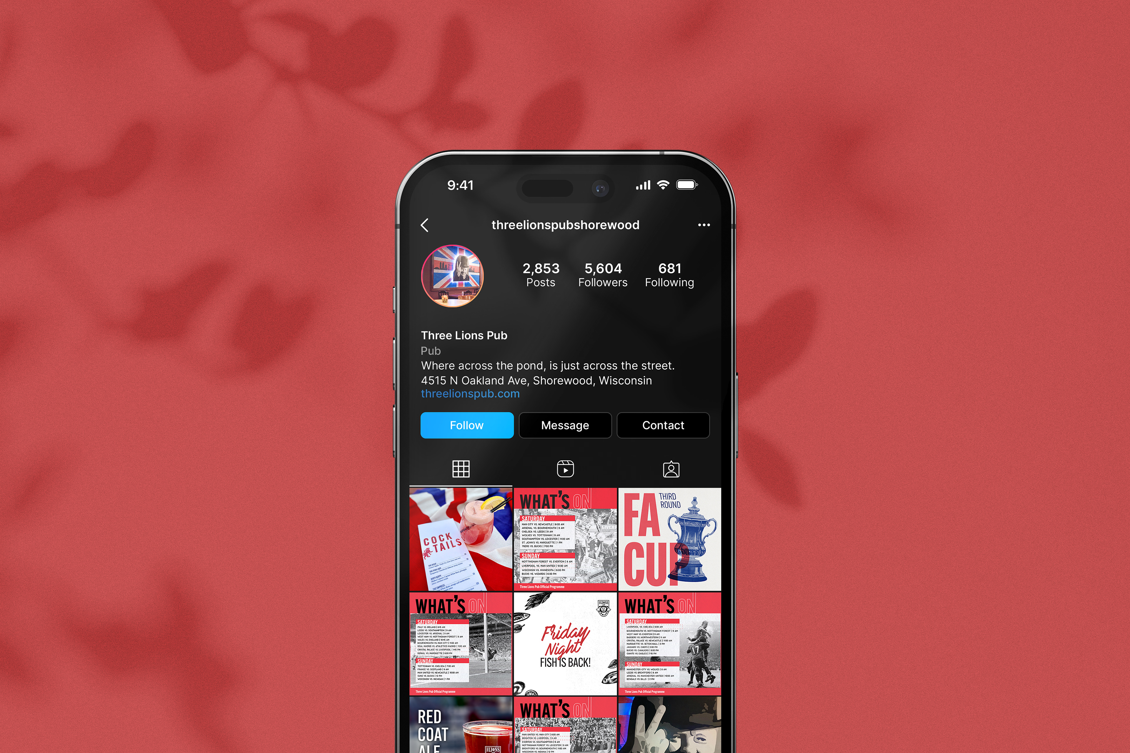
Beyond the physical collateral, I managed their online presence and created the digital visuals. While the overarching brand voice remained consistent to unite the group, the weekly sports content required a highly tailored approach. Red Lion Pub serves as a massive home base for Tottenham Spurs supporters, while Three Lions Pub is a dedicated hub for Liverpool fans. Though all supporters are always welcome at either location, I designed distinct, team-specific graphics and color palettes for match days to celebrate these massive turnouts and speak directly to each pub's uniquely loyal following.